Text
Button
Image
TextField
Form表单
ProgressIndicator
Text
|
|
文本展示
|
|
Container 的定义:
|
|
BoxDecoration 的定义:
|
|
基本属性
|
|

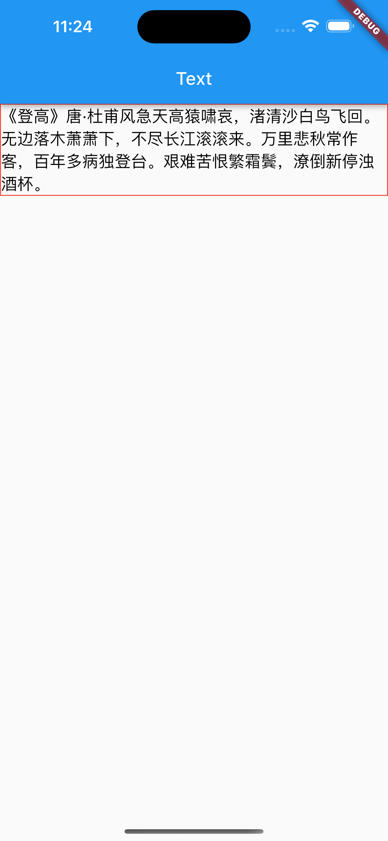
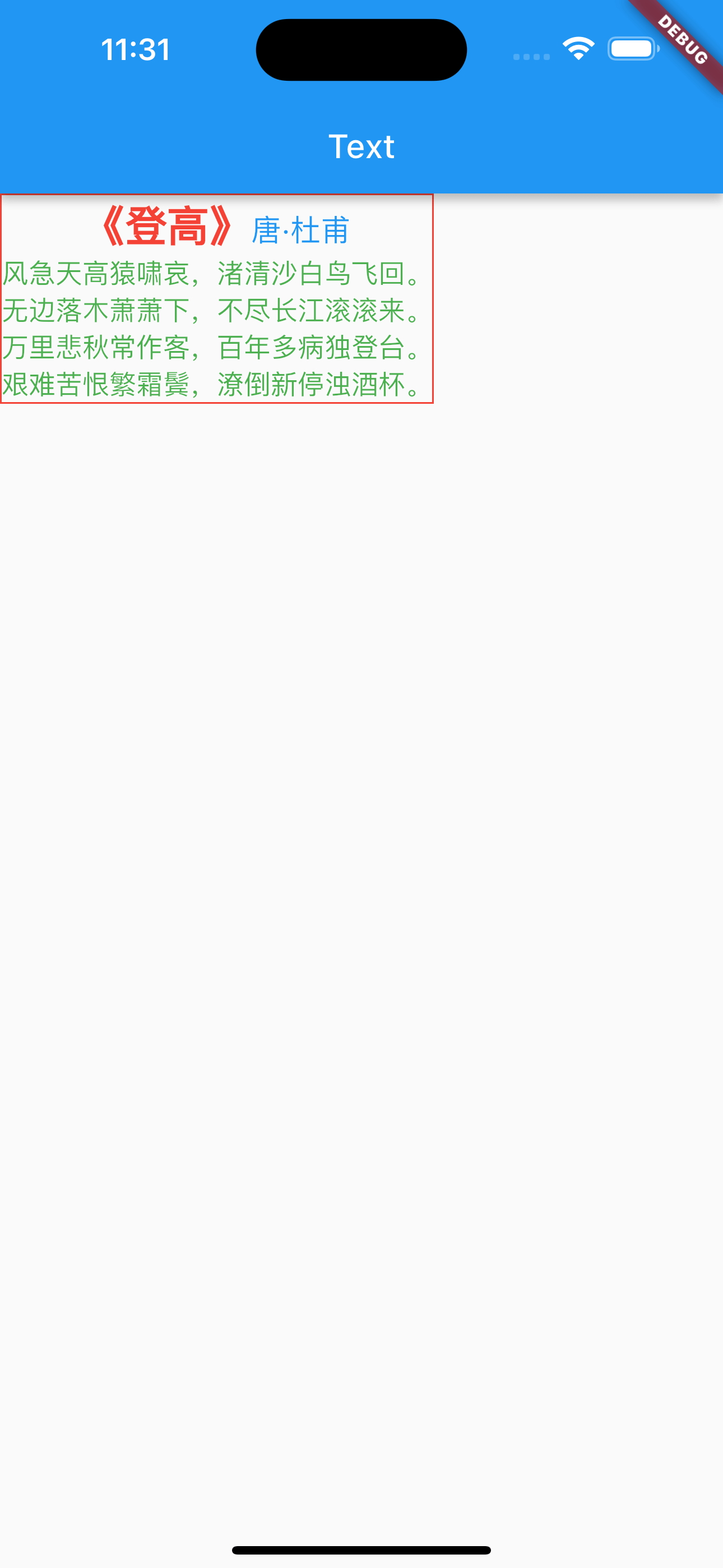
富文本
|
|
Button
|
|
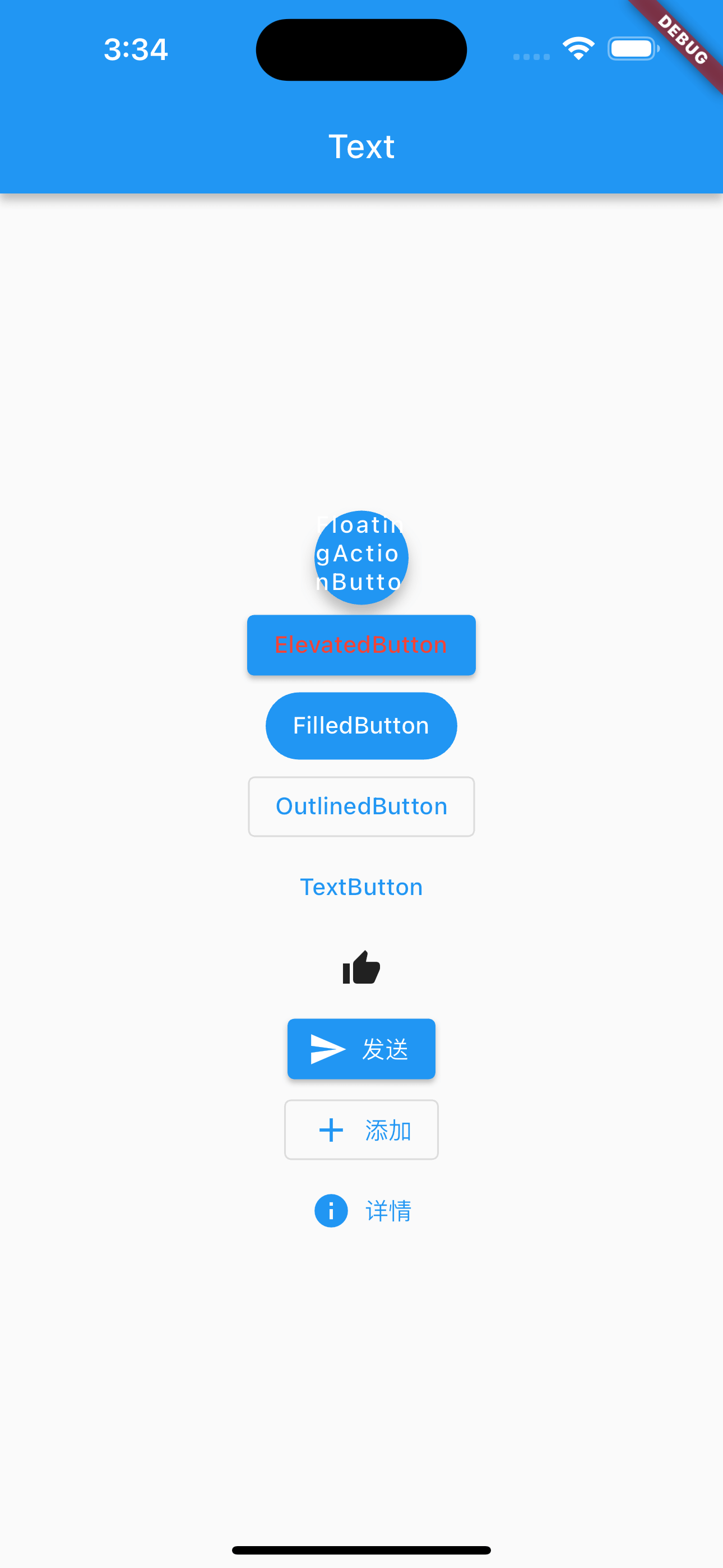
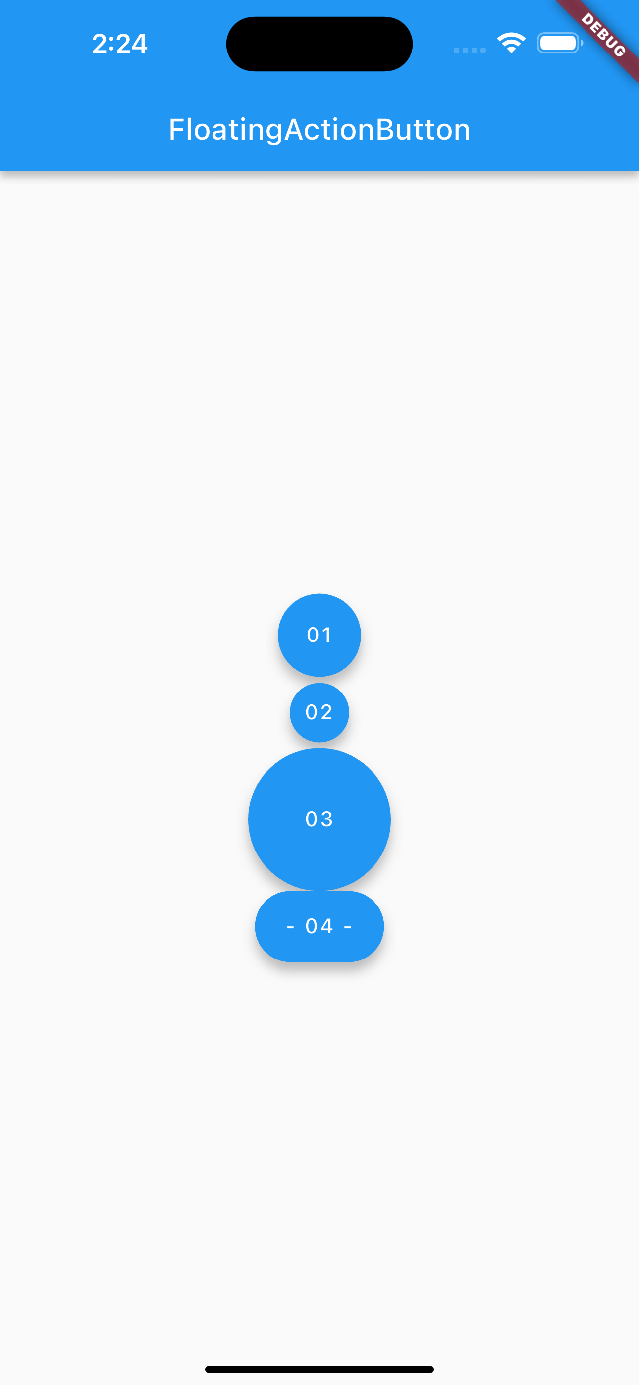
浮动按钮
圆形浮动按钮,默认带有阴影和灰色背景。按下后,阴影会变大
|
|
示例
|
|
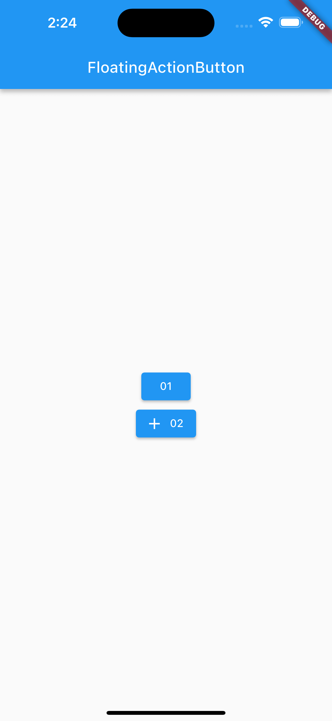
漂浮按钮
“漂浮”按钮,它默认带有阴影和灰色背景。按下后,阴影会变大。
|
|
实列
|
|
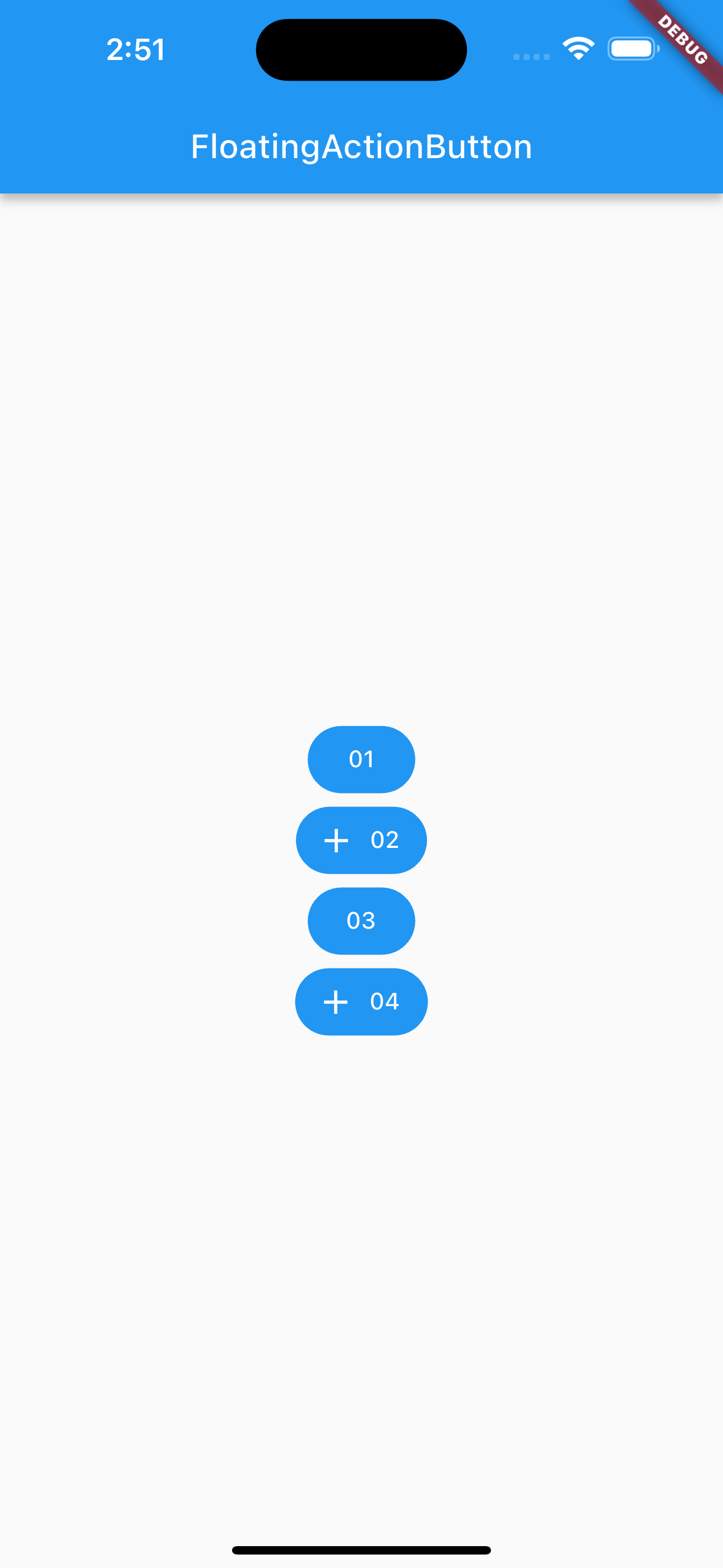
全角按钮
|
|
示例
|
|
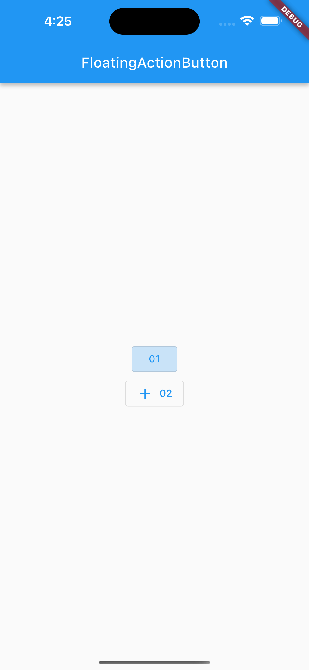
边框按钮
默认有一个边框,不带阴影切背景透明。按下后,边框颜色会变亮。同时出现背景和阴影(较弱)。
|
|
示例
|
|
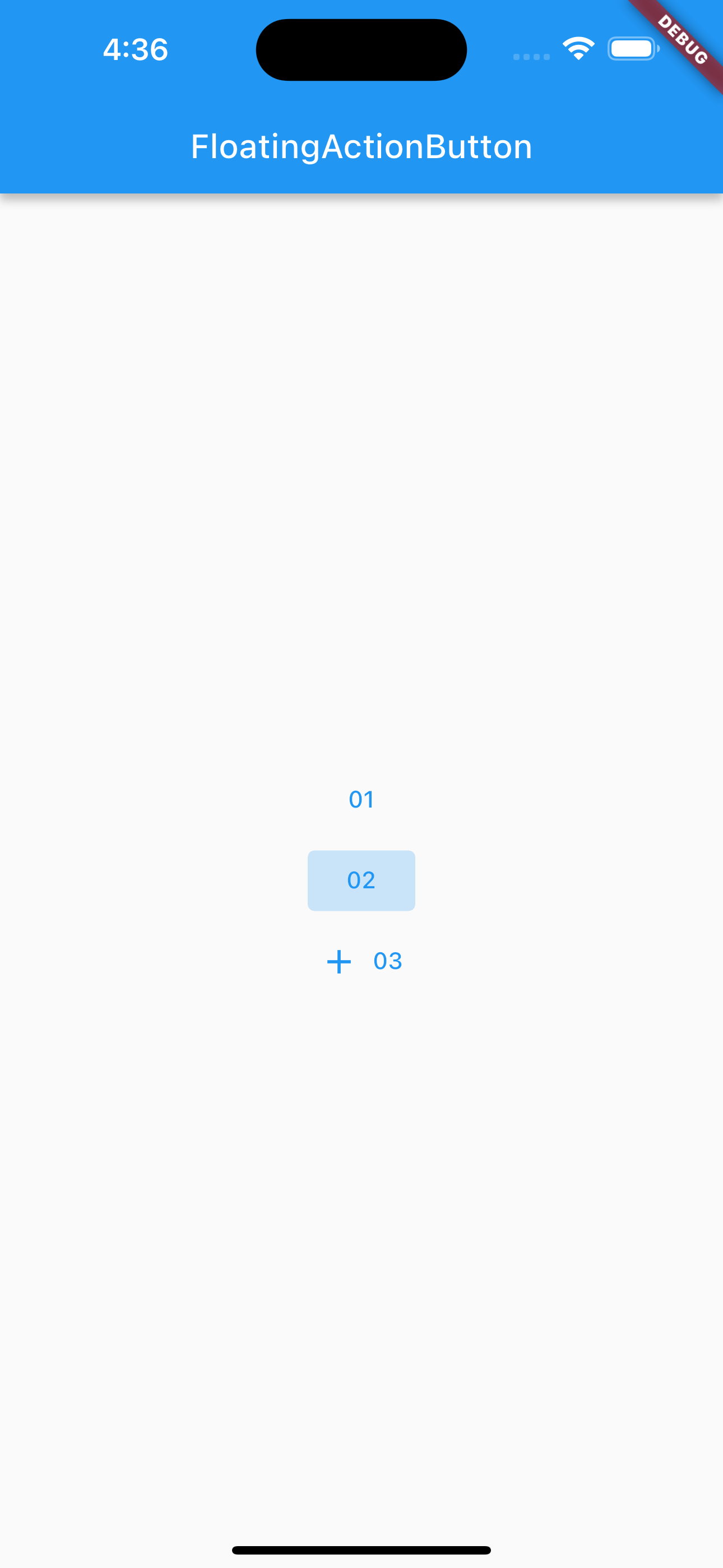
01 按钮是点击后的样式。
文本按钮
|
|
示例
|
|
02 按钮是点击时的样式。
图标按钮
|
|
|
|
+ 按钮是点击时的样式。
,在 Android Studio 中可以使用快捷键 optino + command + b 查看。
|
|
按钮样式:
|
|
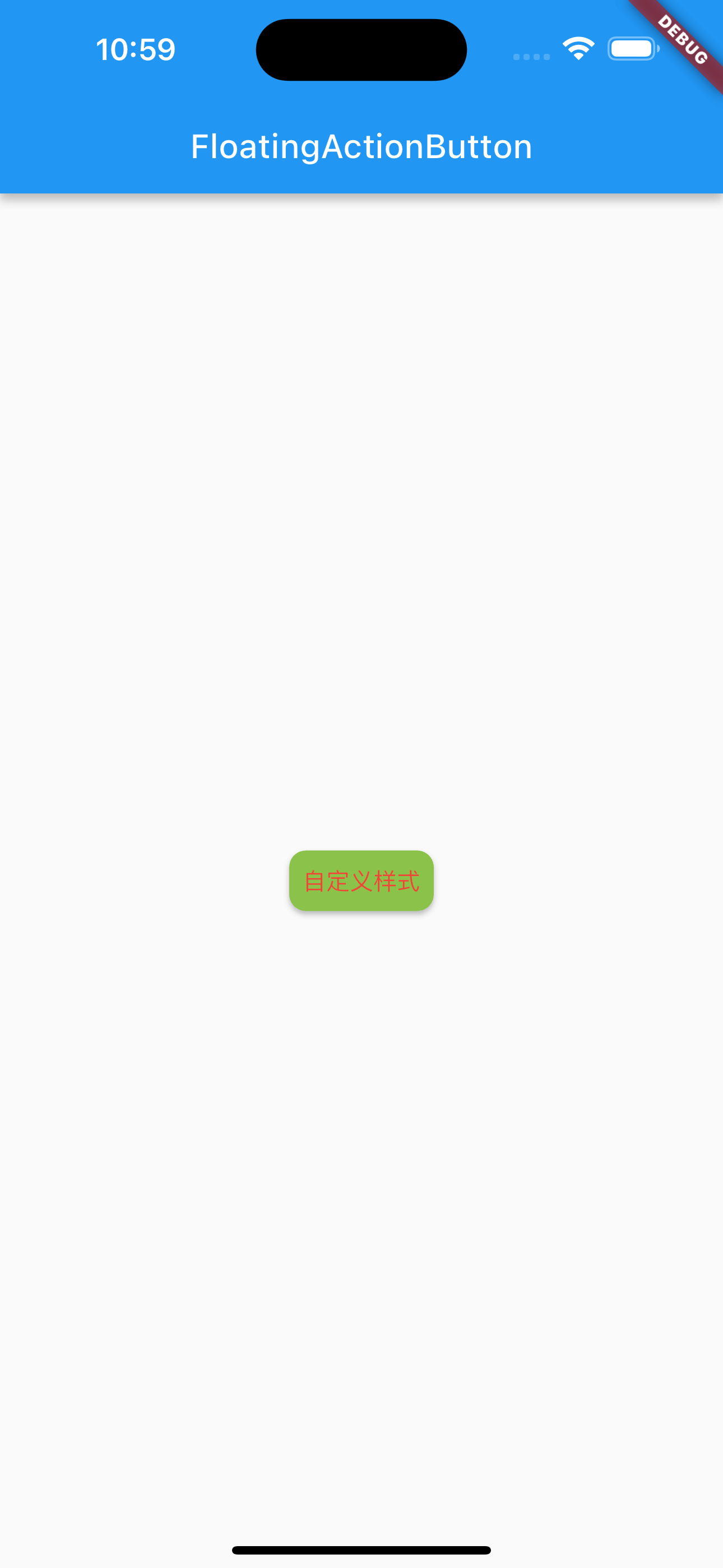
自定义按钮:
|
|
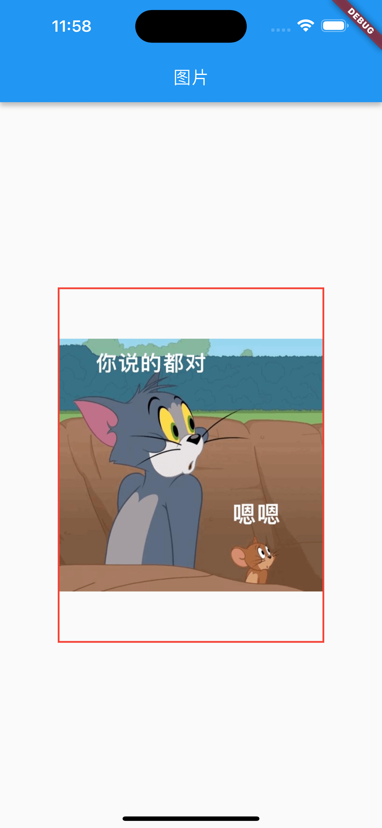
Image
加载网络图片
|
|
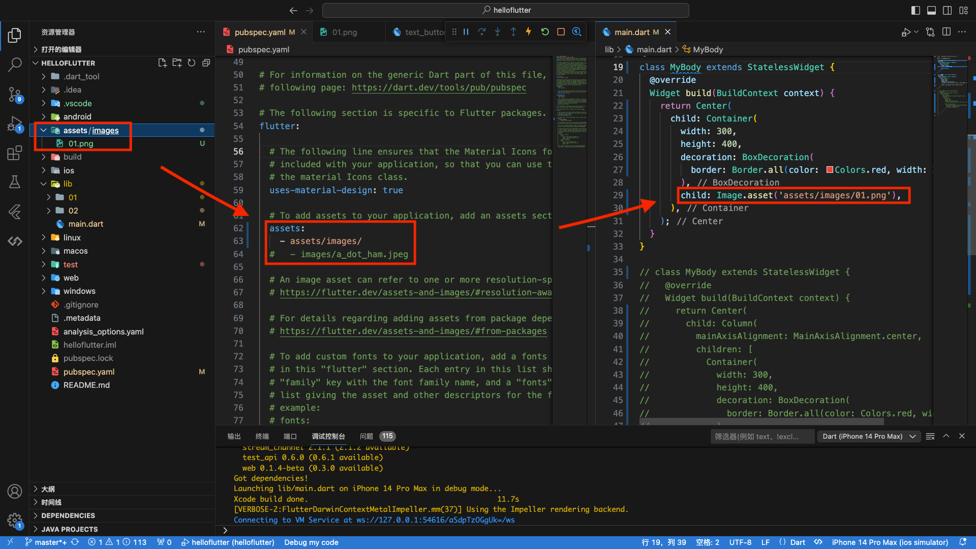
加载本地图片
加载本地图片,需要先将图片放到assets目录下,然后通过Image.asset加载。
|
|
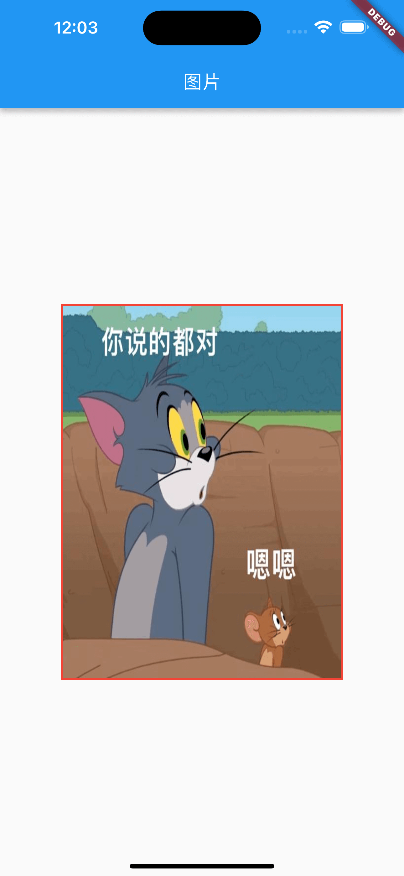
填充方式
fill:填充,图片会根据容器的尺寸进行拉伸contain:包含,图片会保持宽高比,并缩放至完全适应容器cover:覆盖,图片会保持宽高比,并缩放至完全覆盖容器fitWidth:填充宽度,图片会保持宽高比,并缩放至容器宽度fitHeight:填充高度,图片会保持宽高比,并缩放至容器高度none:不填充,图片会保持原始大小,并居中显示
fill
|
|
contain
默认填充方式
|
|
cover
|
|

fitWidth
|
|
fitHeight
|
|
头像
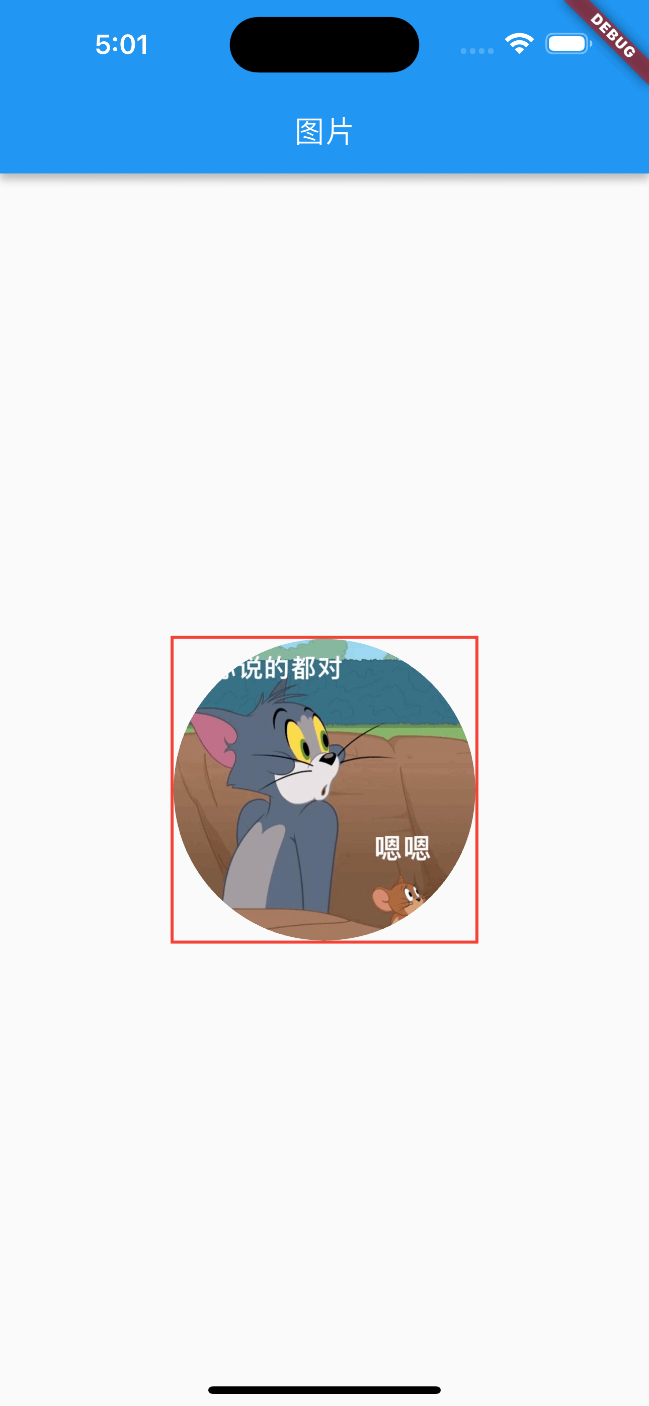
方式一:CircleAvatar
|
|
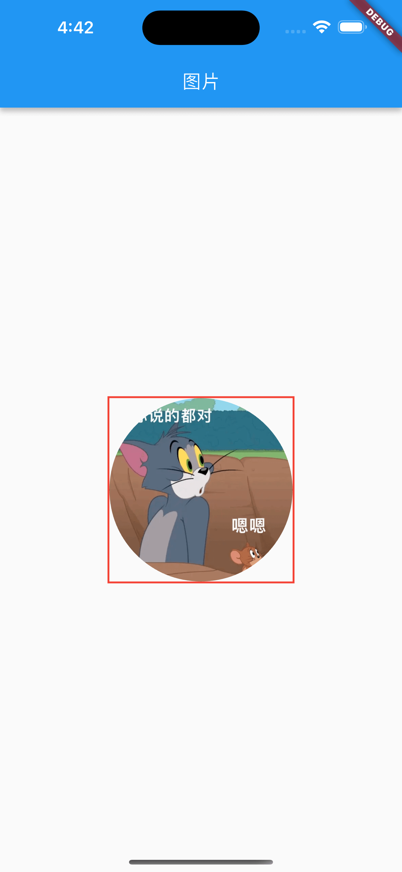
CircleAvatar 的定义:
|
|
方式二:Container+BoxDecoration
|
|
DecorationImage 的定义:
|
|
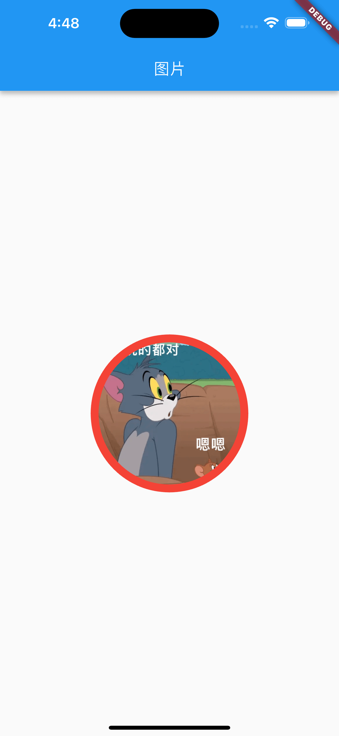
方式三:ClipOval
|
|
ClipOval 的定义:
|
|
圆角图片
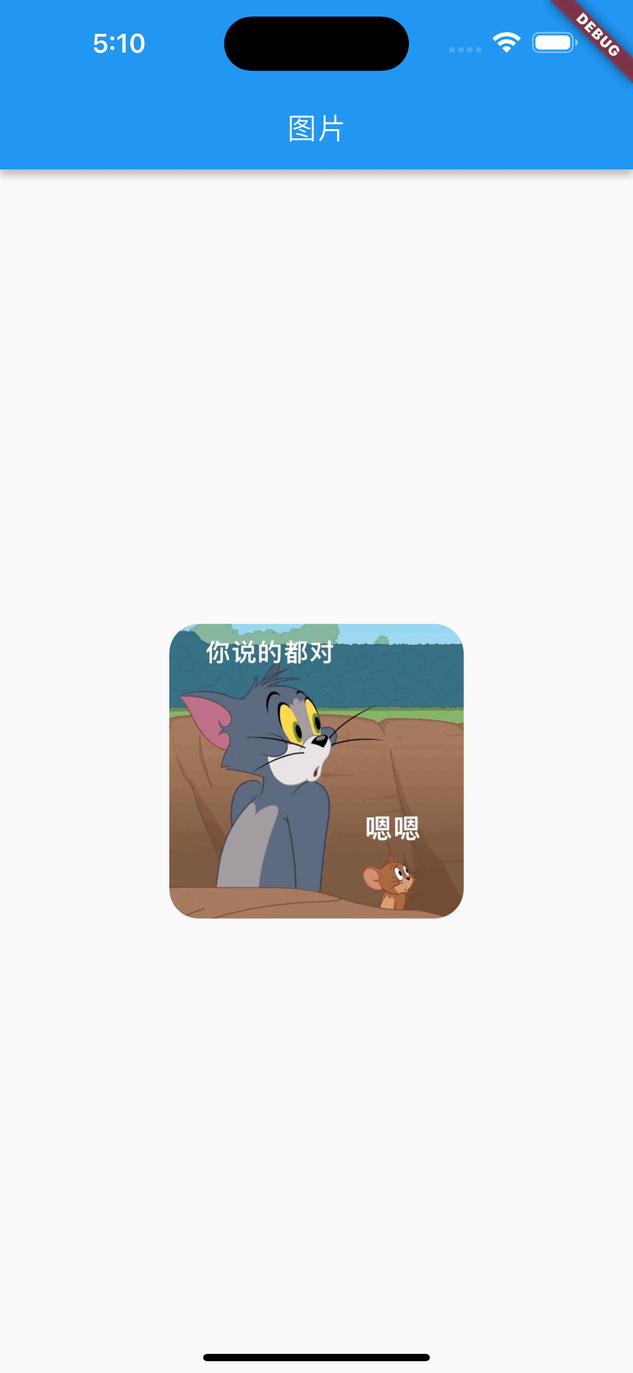
方式一:Container+BoxDecoration
|
|
方式二:ClipRRect
|
|
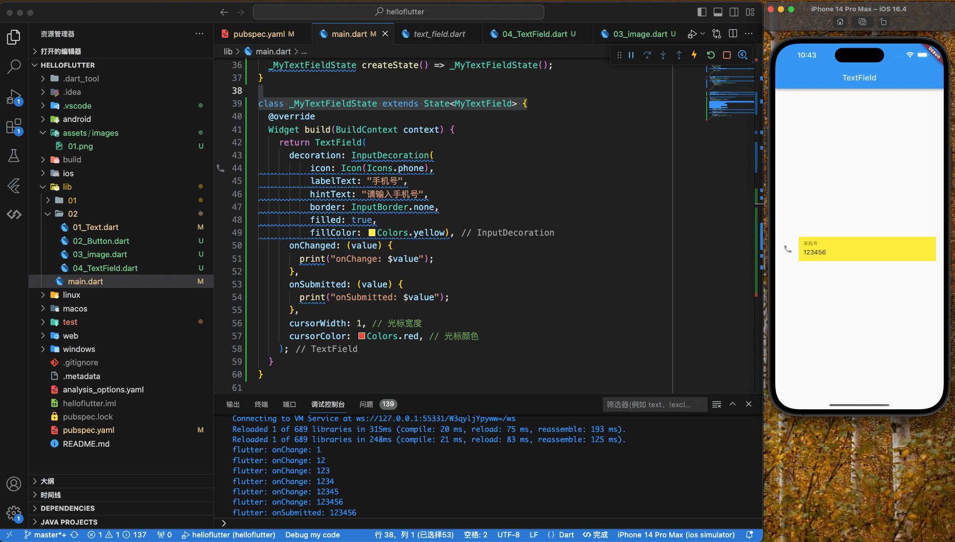
TextField
定义:
|
|
TextField 示例及监听
|
|
打印信息:
|
|
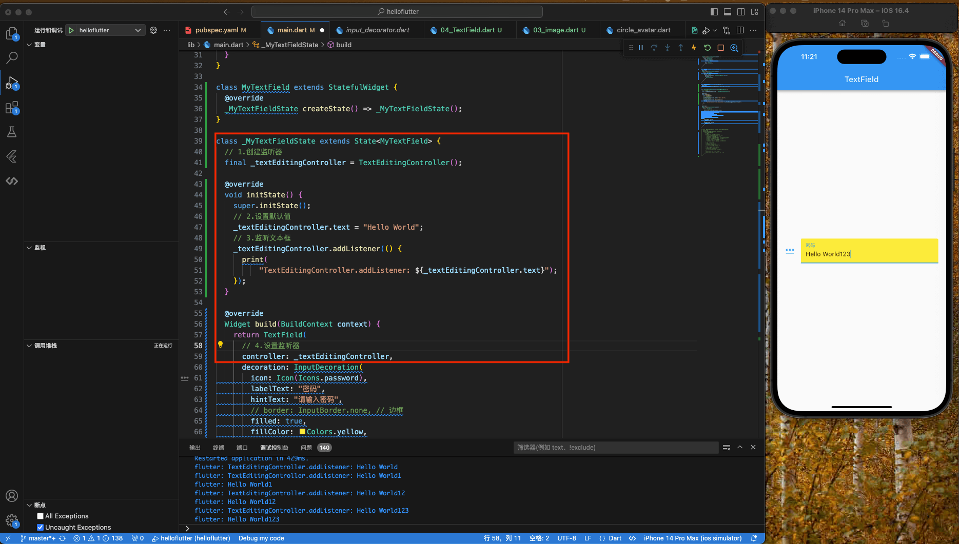
TextField的controller
TextField 的 controller 属性,用于获取输入框的值,并控制输入框的值。包括设置/获取编辑框的内容,选择编辑内容,监听编辑文本的变化等。需要指定 TextEditingController 对象与文本框绑定,如果没有指定,则使用默认的 TextEditingController。
|
|
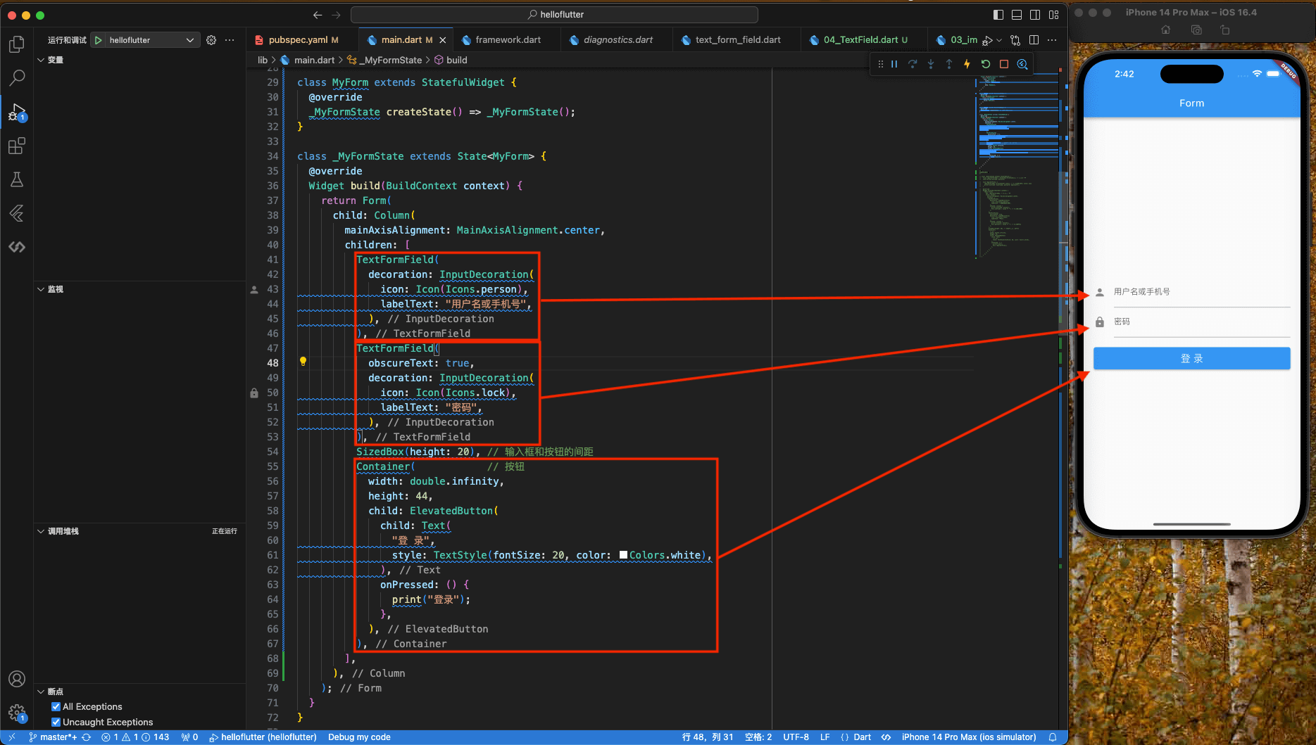
Form表单
Form 表单用于将多个输入控件封装起来,并且提供一些辅助功能,比如验证、自动补全、错误提示等。
TextField 就是 Form 表单的一个子类,在验证过程中,Form 表单会自动调用 TextField 的 validate() 方法,如果 validate() 返回 true,则表示验证通过,否则表示验证失败。
Form 表单可以清除所有输入框的值,也可以重置所有输入框的值。
|
|
FormField
|
|
FormField 是一个抽象类,它有两个子类:TextFormField 和 DropdownButtonFormField。
|
|
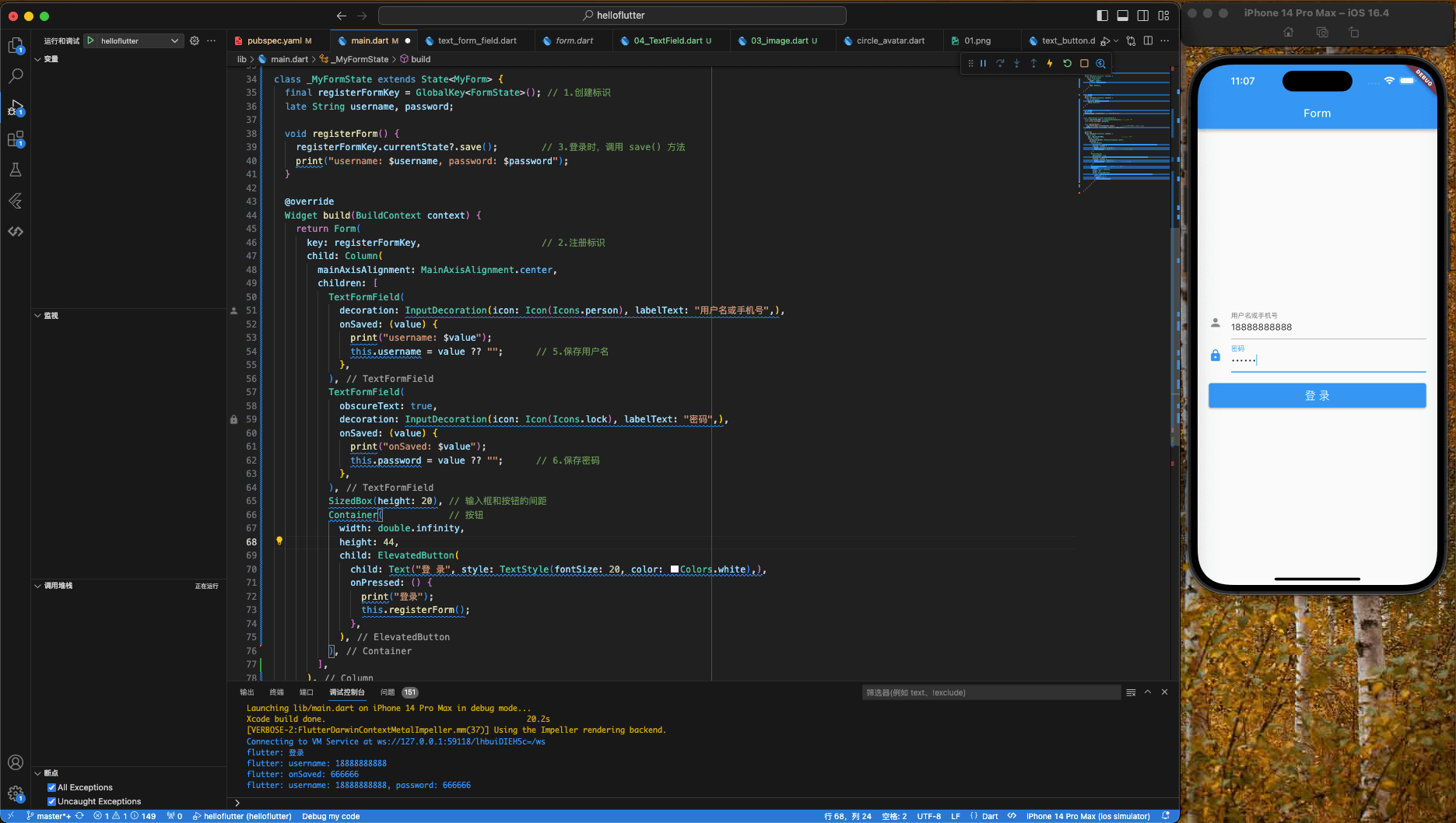
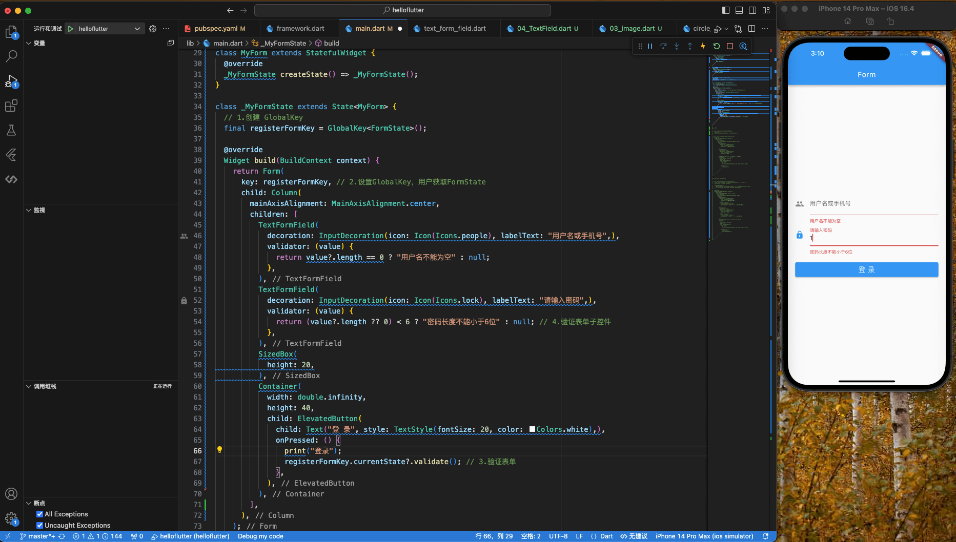
FormState
FormState 是 Form 的内部类,它继承自 State,用于保存 Form 表单的状态。FormState 有一个字段 _formKey,它是 GlobalKey<FormState> 类型的,用于保存 Form 表单的标识。
FormState.save()会调用Form子孙控件的save()方法,保存表单。FormState.reset()会调用Form子孙控件的reset()方法,重置表单。FormState.validate()会调用Form子孙控件的validate()方法,验证表单。
保存表单 FormState.save()
|
|
验证表单 FormState.validate()
|
|
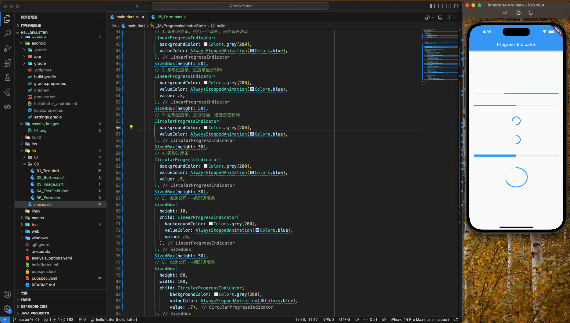
ProgressIndicator
Material 中的进度指示器包括两种:
- LinerProgressIndicator:线性进度指示器
- CircularProgressIndicator:环形进度指示器
LinerProgressIndicator
|
|
CircularProgressIndicator
|
|
示例
|
|